PurpleTie: Redesigning an
iOS Laundry Service App
PurpleTie
About PurpleTie
PurpleTie is an on-demand laundry and dry cleaning service that provides delivery services to homes and Bay Area companies. Founded in 1999, they have grown primarily through company partnerships and word-of-mouth.
Client Request
The app had been created around 2010 and had not been updated since. It had high drop-off rates upon initial download and 2.5 star reviews on the app store. Their limited digital infrastructure was hindering scalability. Our team was approached to redesign their entire app to strengthen their online presence and support growth.
Discoveries
User Flow
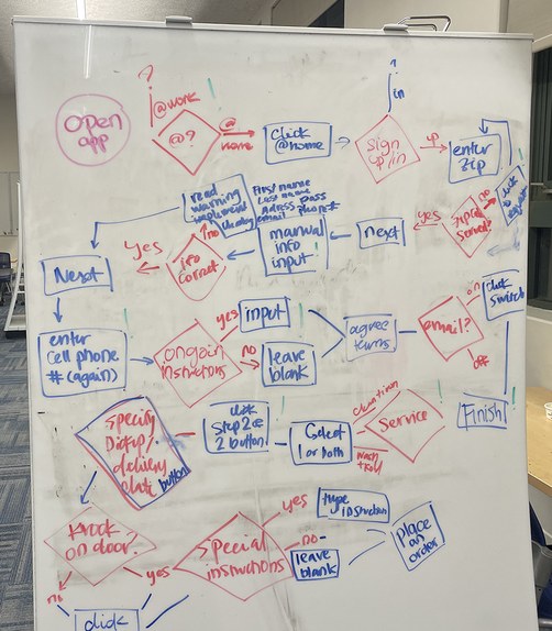
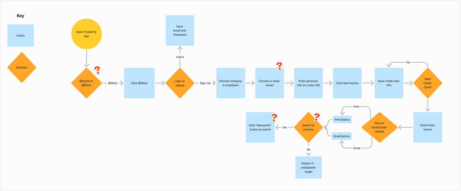
As a team of six, we sat down and jotted the entire apps user flow. We realized there were huge inefficiencies with repetitive questions, unclear instructions, and too many decision points.
Interviews
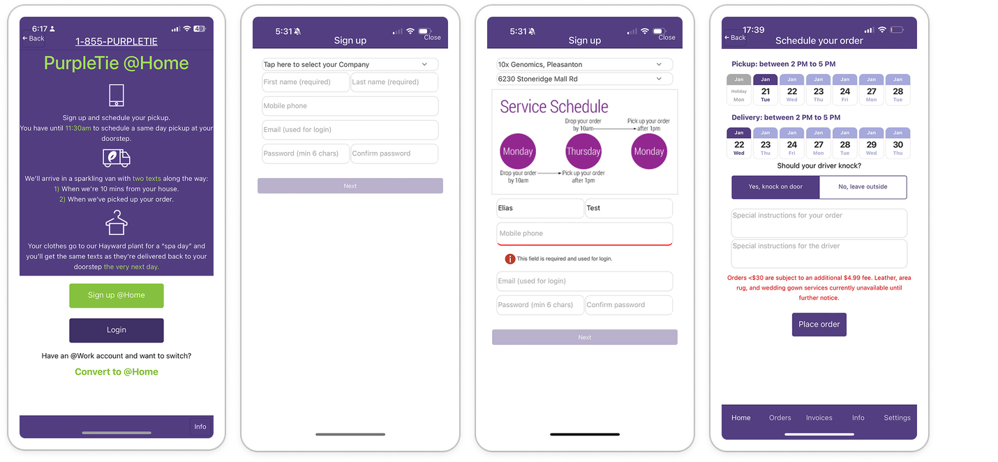
We then conducted 15 usability tests, asking individuals to think-aloud as they navigated the app. The word “confused” came up over 70 times.
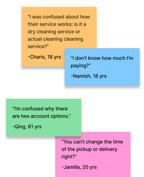
We concluded that the high drop-off rates were caused by low trust from...
Poor visual design and frustrating navigation
Payment barrier during onboarding
Lack of service information and pricing transparency
The Fixes
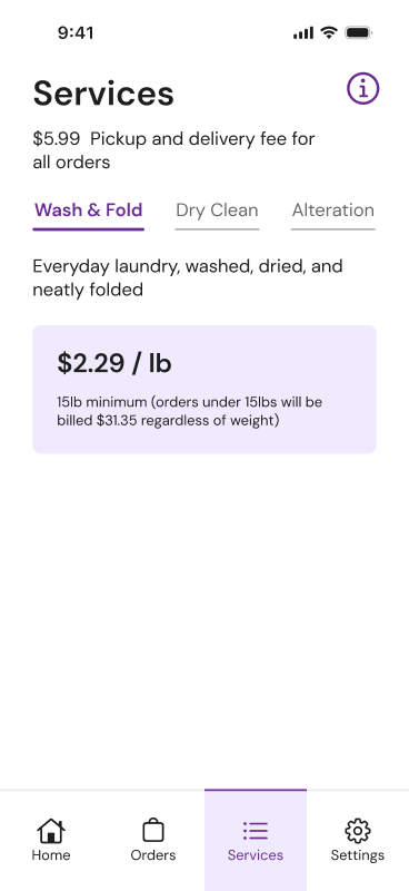
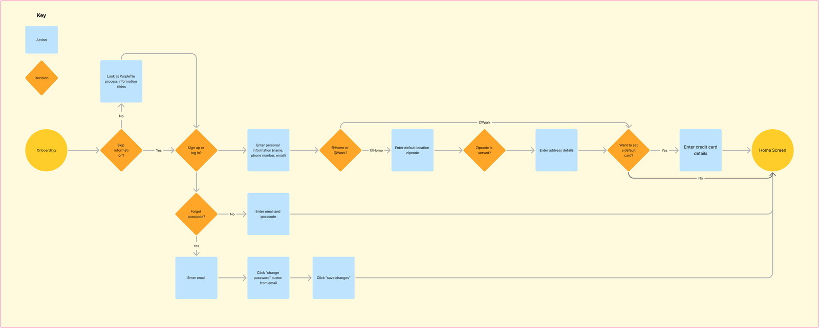
To combat the frustrating navigation, we mapped out a new user flow to streamline the ordering process. We reduced onboarding friction by moving the payment screen from the sign-up flow to after user’s input their first order.
Before
After
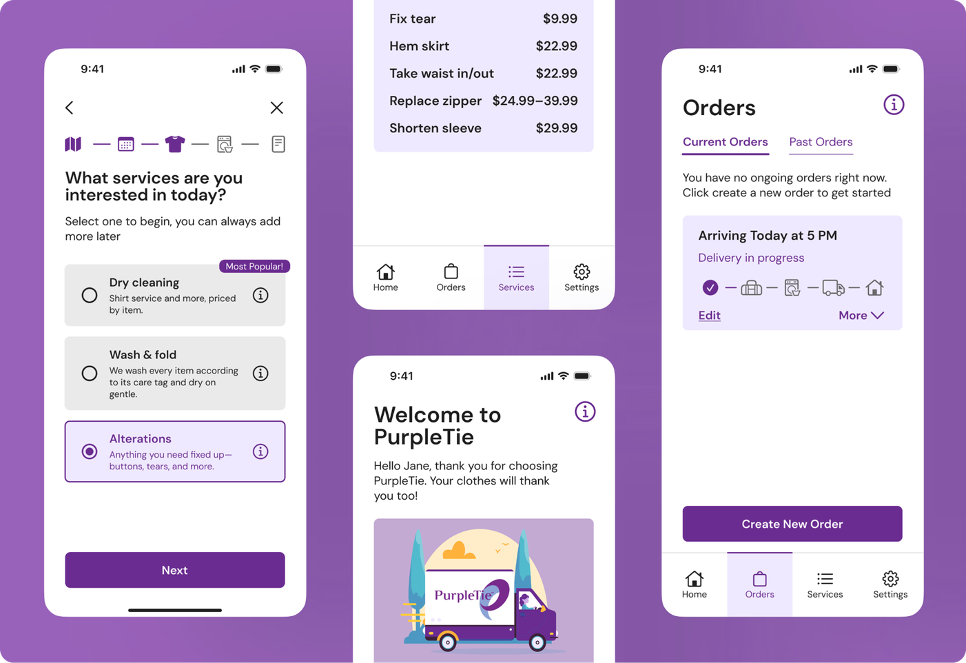
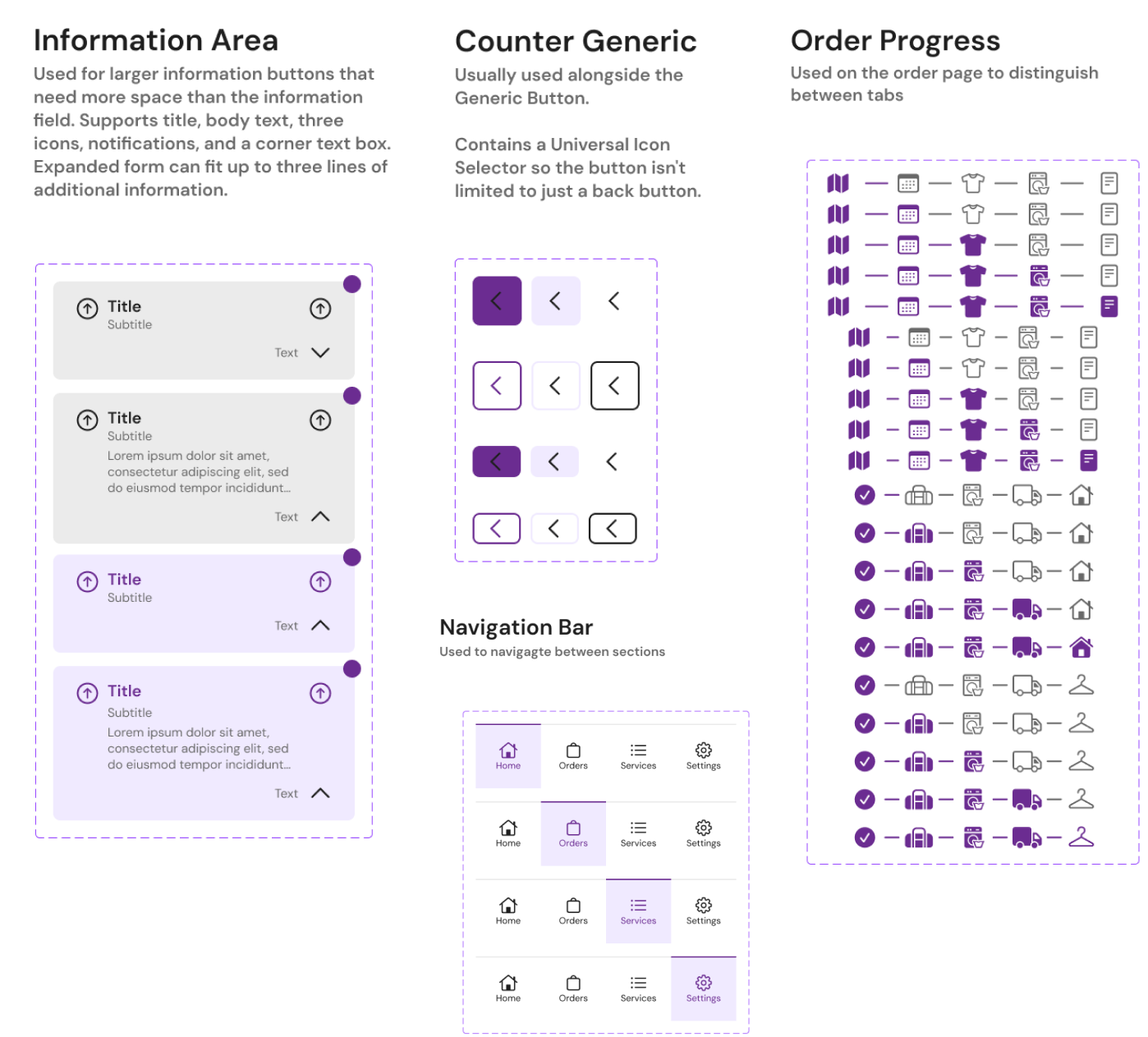
After spending long hours as a team, even mulling over tiny details, down to the emojis in our playground file, we established a consistent design system with 30+ components, standardized across 150+ screens:
- Spacing: Standardized margins, padding, and layout conventions
- Visual language: Unified colors, states, icons, and visual indicators
- Core components: Established consistent navigation bars, progress bars, buttons, etc.
- Input & interaction: Standardized input fields and interactive states for a cohesive experience
See examples on the right
Challenges
How could we balance the integrity of the service with the wants of the client?
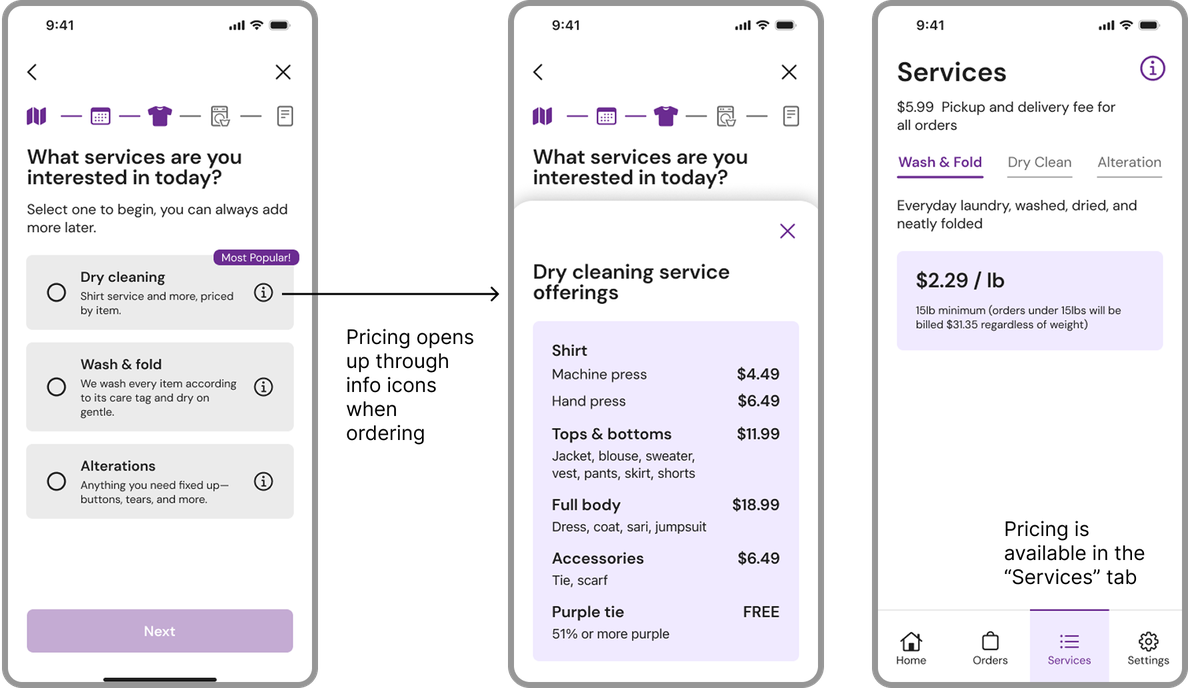
Through our user research, we established that the inaccessibility of pricing information was lowering user trust and hindering new users. Hence, we made it a goal to make pricing information more accessible. Our client, however, did not want pricing to be easily visible to users, as he feared it might discourage them from making an order.
To balance stakeholder concerns with user trust, we applied progressive disclosure by revealing pricing only at relevant decision-making moments. Pricing was excluded from onboarding, but remained accessible through a dedicated Services page in the nav bar and info icons during the ordering process. This ensured transparency while maintaining the goal of high conversion.
Finale.
See it on the App Store